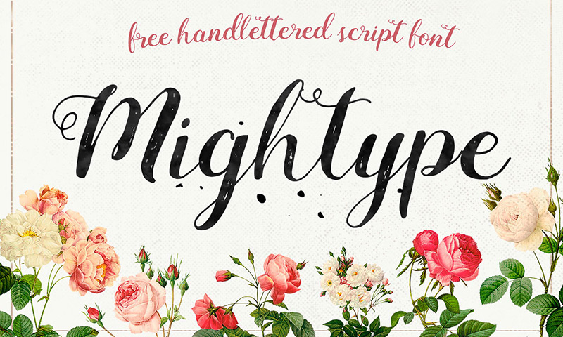
Typesetters, compositors, typographers, graphic designers, art directors, manga artists and many more people of different professional setups have worked long and hard to establish modern typography as art. Typography is a method used to arrange type to make written words readable and attracted when displayed. The term typography is also used to describe the style, arrangement, and appearance of letters, numbers, and symbols. By choosing different font faces, sizes, line lengths, line spacing, letter spacing and the adjustment of space within the letters themselves, typographers have succeeded in making this a delicate craft and profession.
Historically speaking, with the first generation of typographers arouse the use of “bitmap” fonts (which was a technique in which graph paper over a drawn letter allowed for it to be colored in using the boxes lying within the boundary of the charter). Next, there came the arrival of “scalable” outline fonts (which were smaller in size and faster to process). “Scalable” fonts allowed typographers to create an outlined representation of different letters using a mouse or stylus, after which, the fonts could be entered into the computer’s system. Today, True Type Technology allows for control over pixels in such a way as to determine when to turn them on and off. “Delta” hinting or “ESQ” (Enhanced Screen Quality) hinting allow users to pinpoint specific areas of an outlined letter with specific sizes and resolutions in tow.
Did you know about some of these interesting facts?
- Comic Sans was created because Times New Roman didn’t sit well with the Microsoft Bob animated dog helper, Rover.
- Ampersand stems from the Latin word “et” and the symbol itself is a combination of the two letters.
- The interrobang (which is a symbol that combines a question mark and an exclamation point) was created to make “?!” more appealing.
It’s important for a typographer to keep in touch with all of the latest trends in the market
- Ligature discretion (which is a method in which an image appears when you type an object, for example, “car”)
- The redefinition of simplicity and legibility (i.e. simple, decent and modern typefaces)
- The use of slick stencils
- The return of the Didone (with super thin serifs that have different thick and thin lines)
- The revival of the classics (from Copperplate Gothic to Garcon Grotesque)
- Fonts made of objects (usually used for an individual purpose, project or even campaign)
- The Craig Ward effect (an incredibly artistic approach to typography)
- Lighter slab serifs (lighter and more sophisticated, these thinner serifs provide a creative touch to any typed piece)
- Charismatic legibility (fonts with personalities is what this decade has brought about)
- And many others
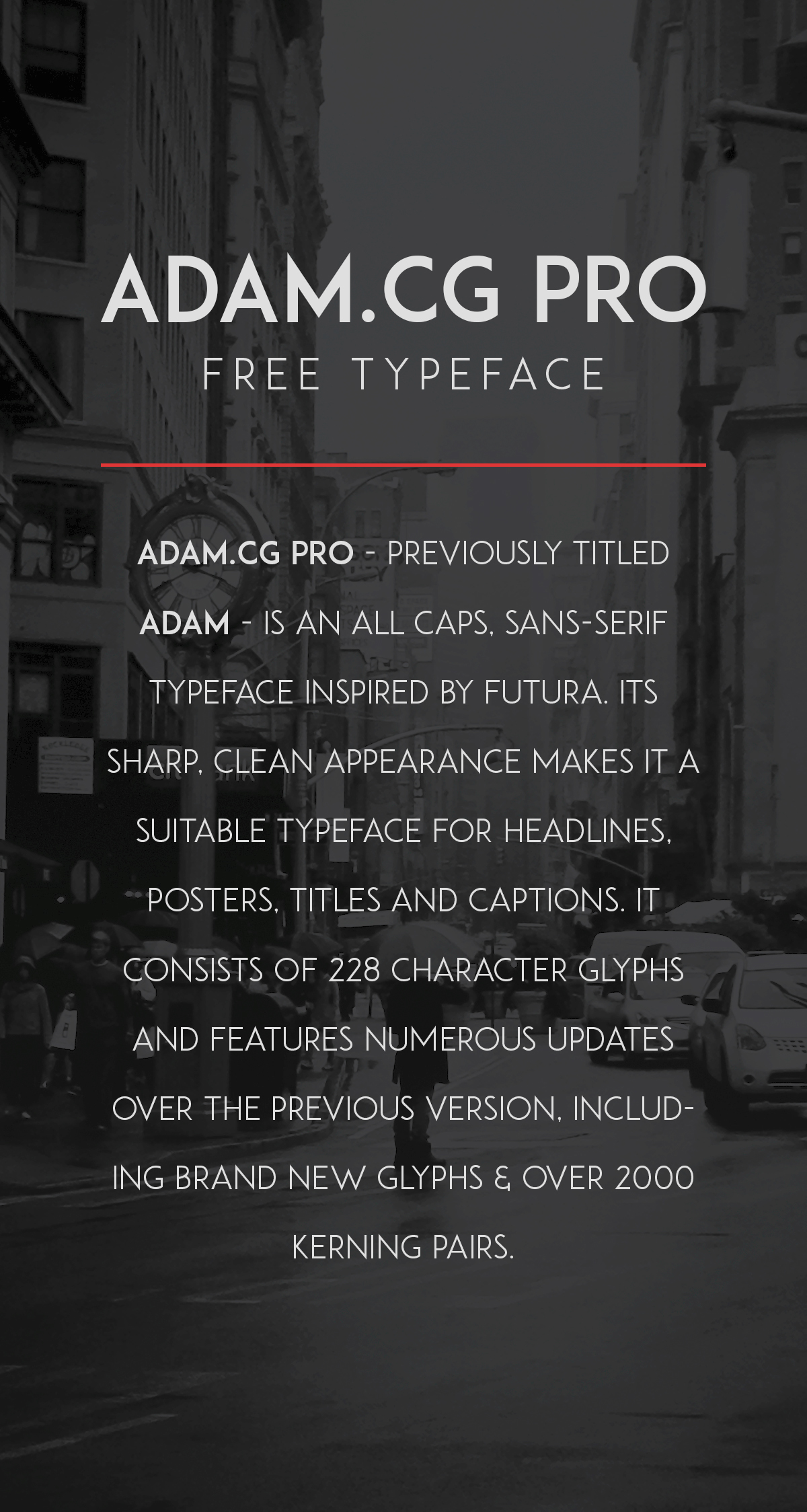
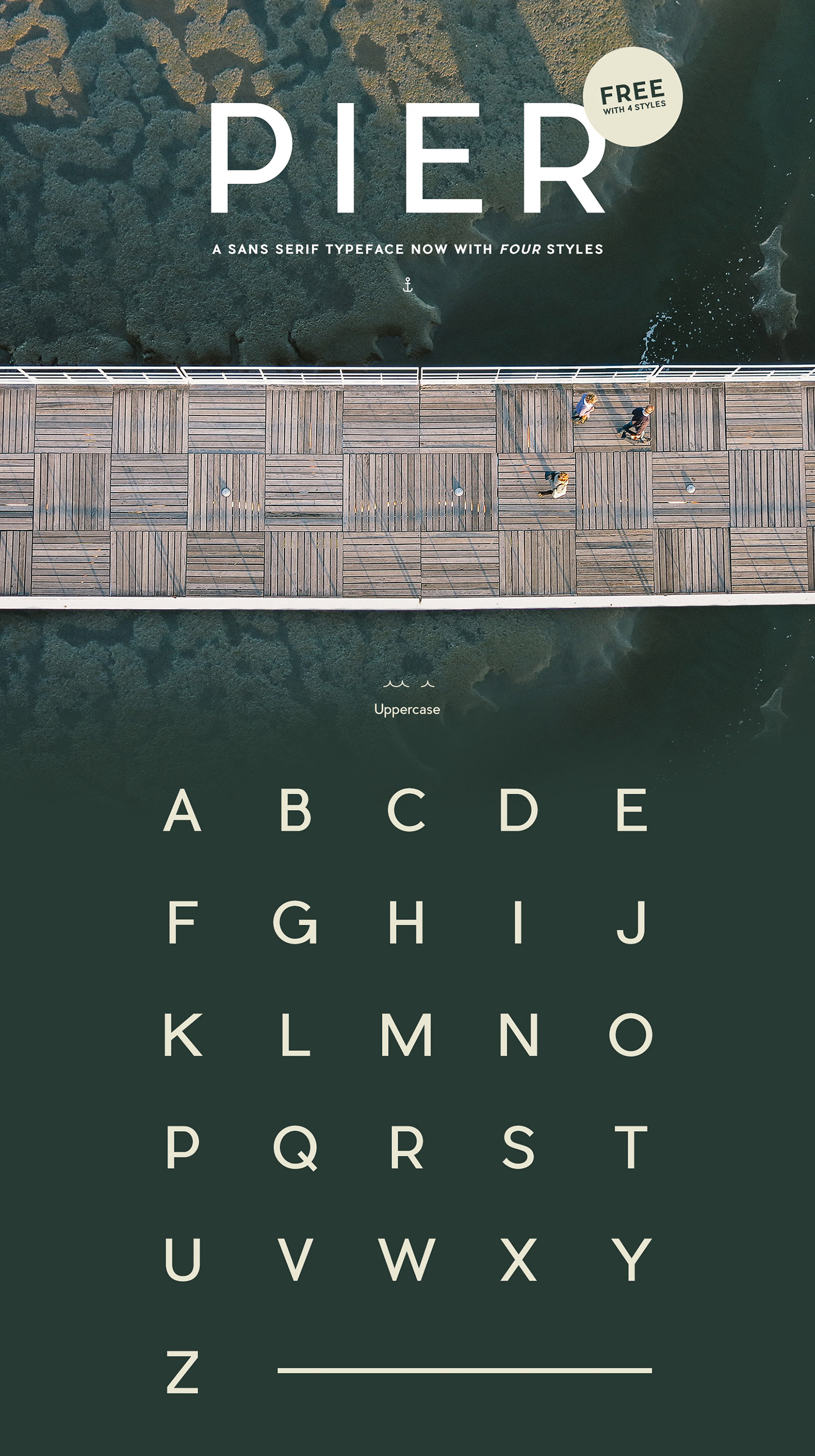
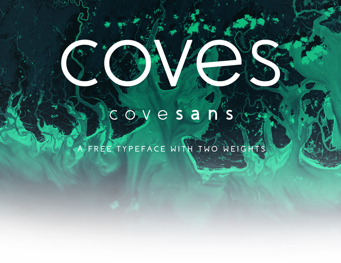
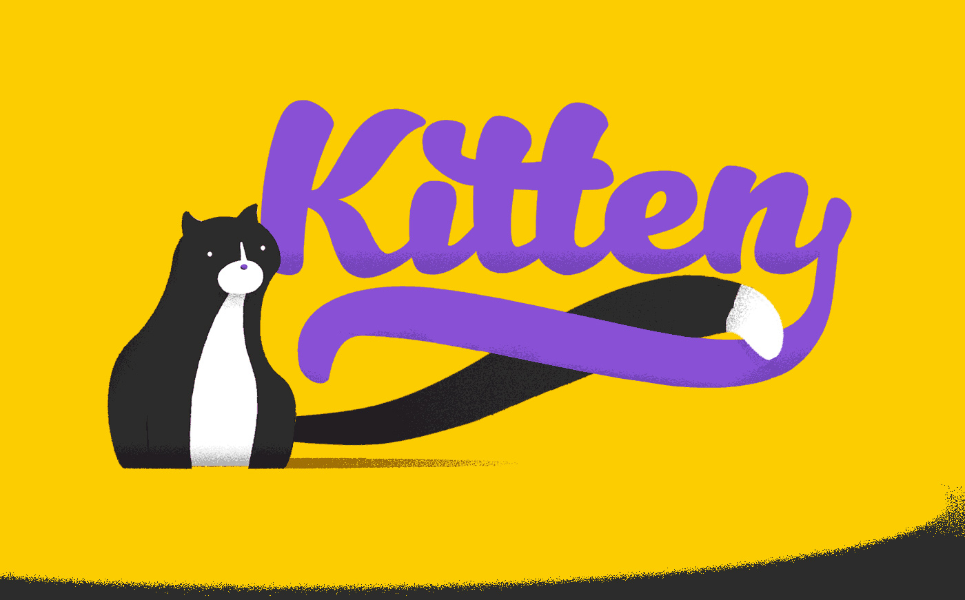
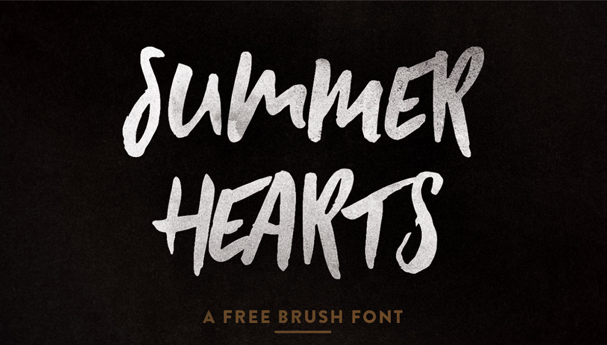
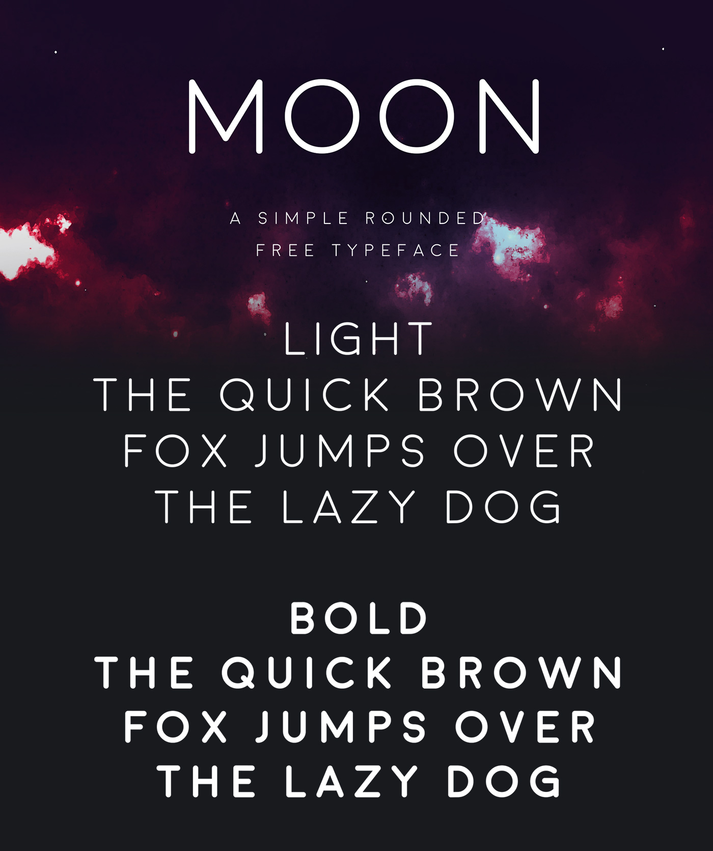
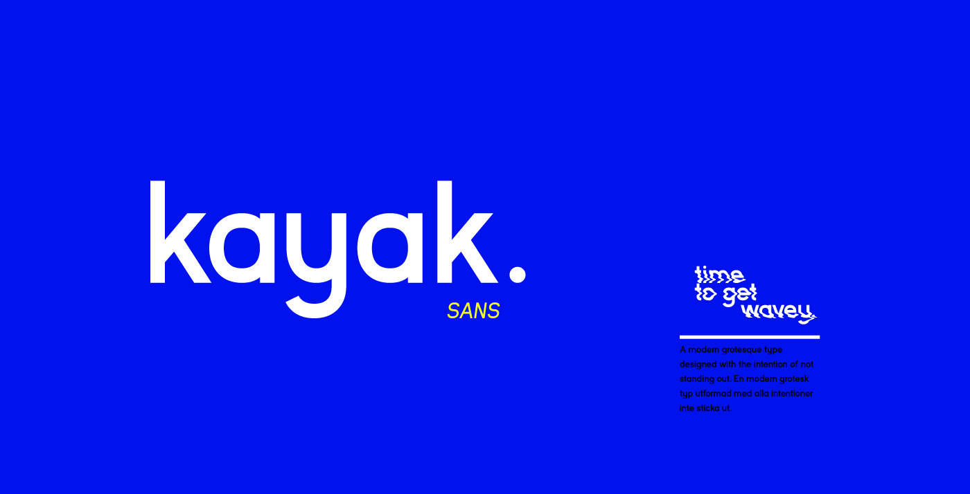
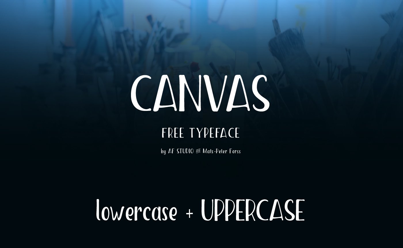
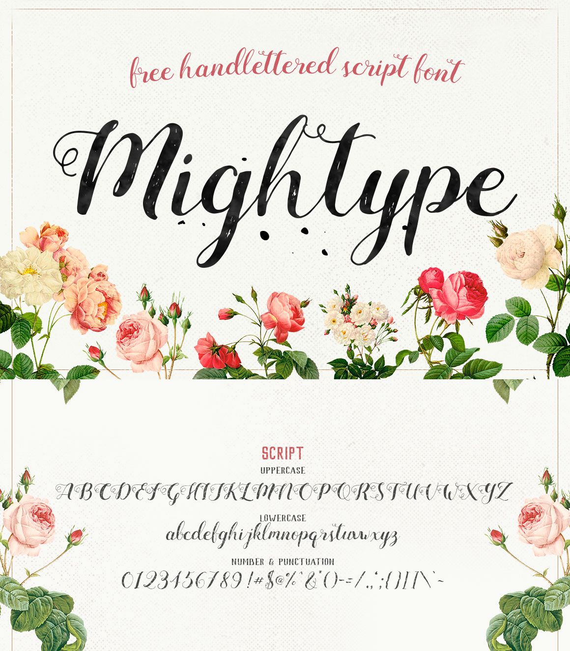
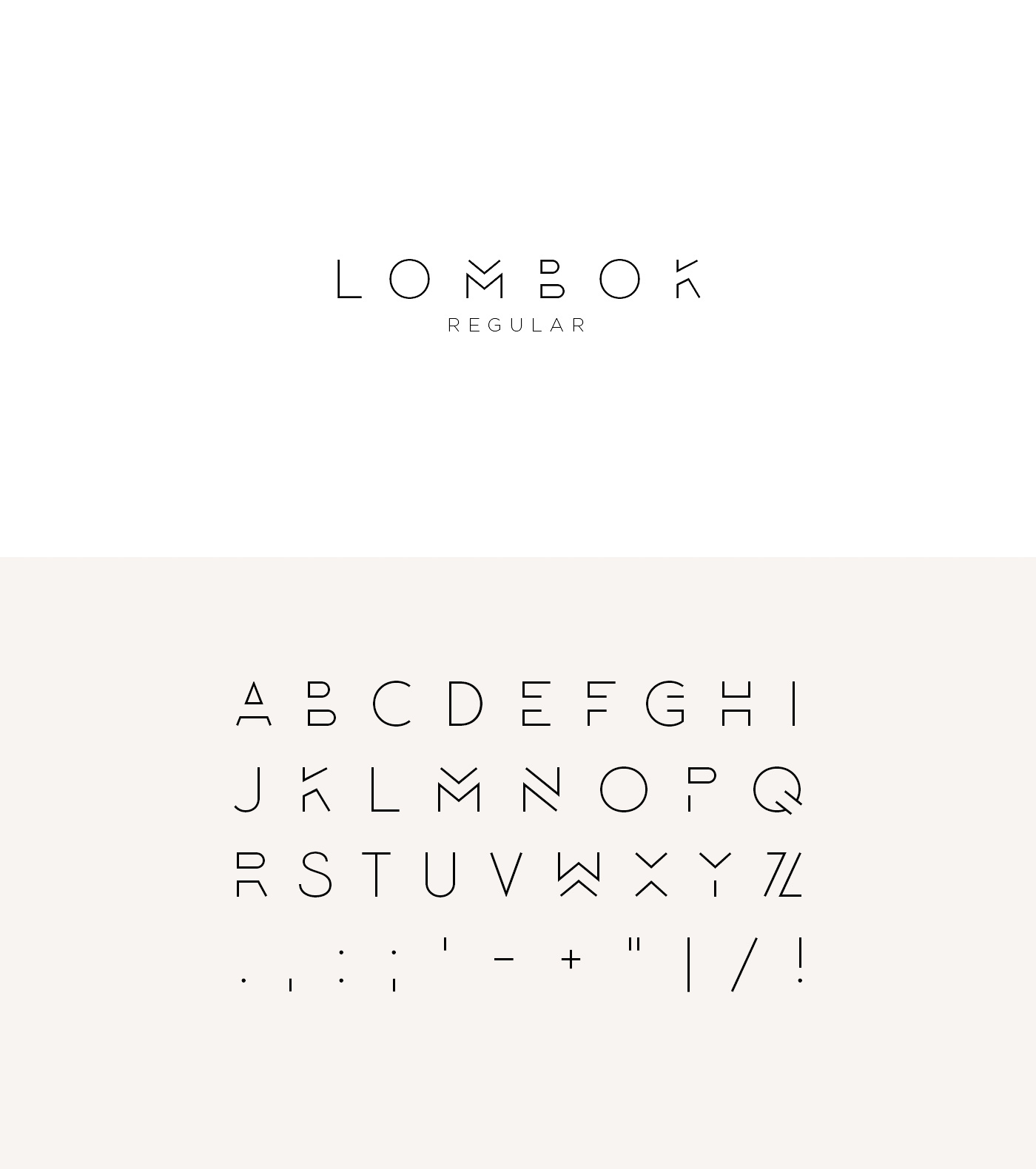
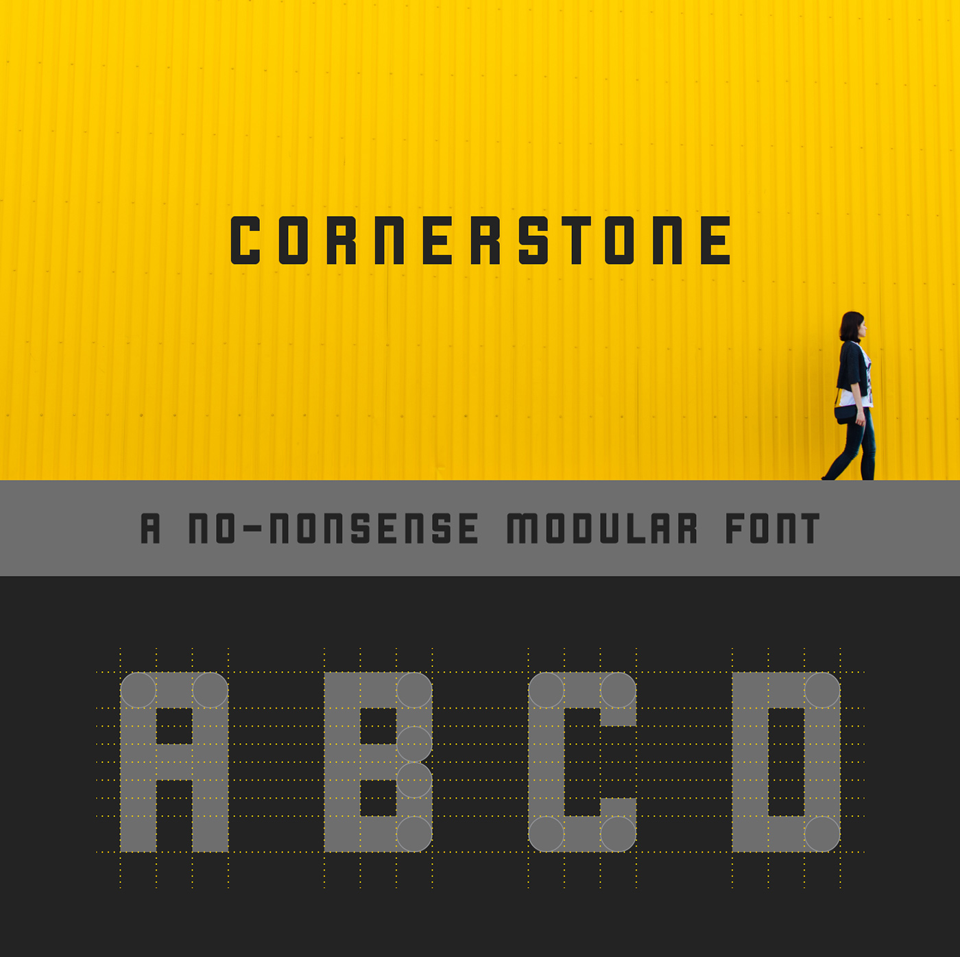
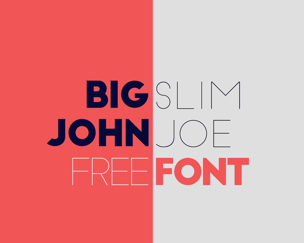
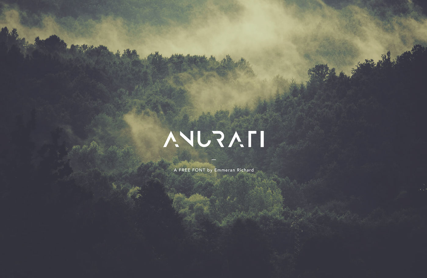
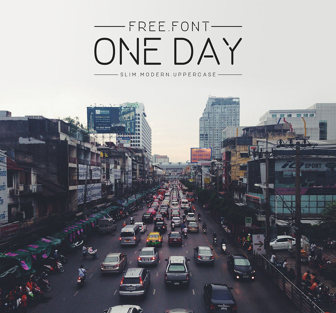
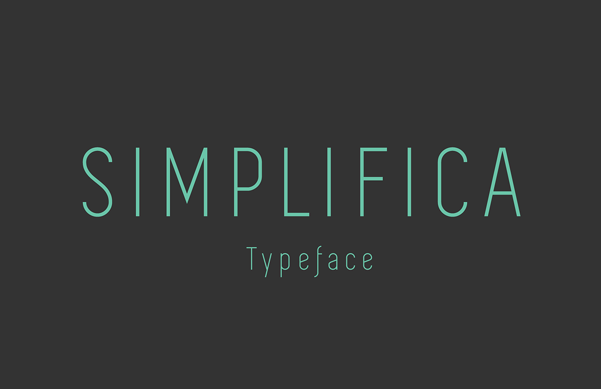
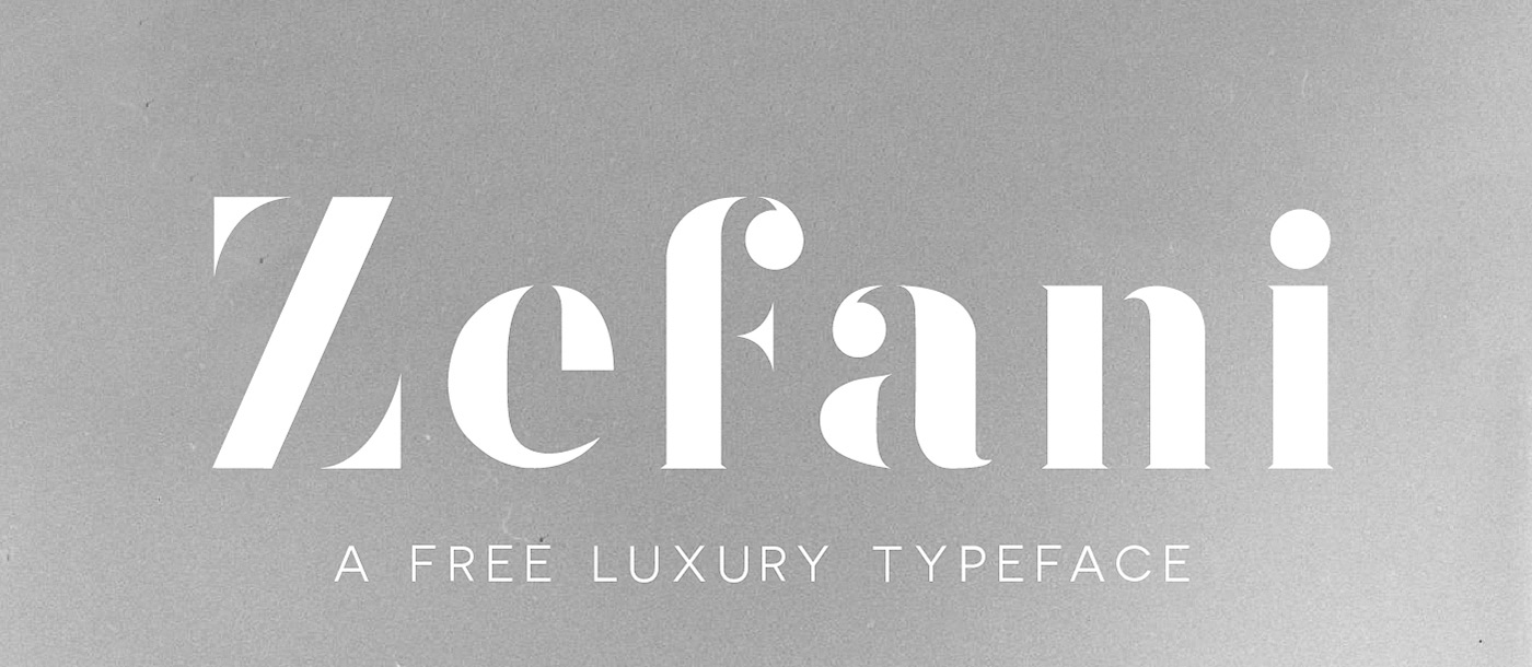
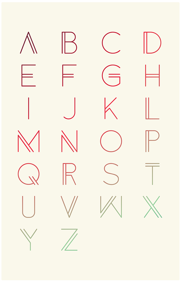
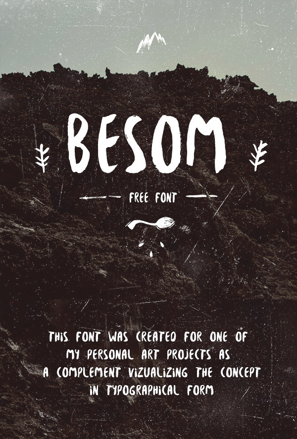
Here are 18 examples of well crafted free fonts:
By Dreamstale
Get creative with our free & premium design resources. Download a vast collection of graphic design materials, such as graphics, sublimation designs, icons, textures, stock photos and more.
Plus get access to Photoshop tutorials & inspirational articles that will spark your imagination.

